

Choosing the right white paint colours can feel surprisingly difficult. With warm whites, cool whites, and neutral tones available, selecting the perfect shade depends on lighting, room use, and overall style. From cool white to warm white, from creamy white to crisp white, white paint colours run into dozens of different varieties—each creating a slightly different mood within a white interior design scheme.
At Oraanj Interiors, we always end up walking clients through this surprisingly tricky question. This is how you choose the best white paint for your home. For those looking to stay ahead of design trends, understanding the Best Interior Colour Schemes for London Homes in 2026 can help inform choices for whites and complementary tones throughout your space.
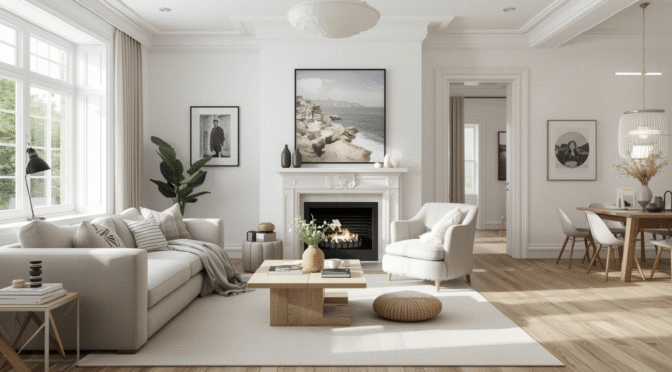
Where smaller city apartments are concerned, too, the subtle variations in white can create a marked difference in the apparent size or tranquillity of a space. This is why many Interior Designers in London place greater importance on the design choices related to white versus finishing touches.
1 . Understand the Undertones: Warm vs. Cool Whites
White paint isn’t actually white. Most whites have a little warm or cool undertones, like yellow, red, beige, blue, grey, or green.
Warm whites are very comforting. Perfect for a north-facing aspect or a room where natural light is limited.
Cool whites give a clean and fresh feel and are very up-to-date. They are always suitable for south-facing or minimalist rooms.
Tip: Always calibrate your colours by testing the colours first on your wall before seeing how it will actually look in various lighting conditions.
When we visit sites, we notice that a white that appears to be neutral in a showroom may have a creamy or grey appearance when applied to a whole wall, especially near wooden flooring or a stone finish. It is important to note that having to decide between warm and cool whites is not the only factor to consider, and one should also consider their Custom Furniture Design because of the effect of the colours of the furniture and other elements of design that accentuate the undertones of the paint colours chosen.
2 . Consider the Lighting in Your Room
Light plays a huge role in how white paint appears. Here’s a quick guide:
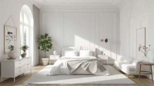
North-facing rooms: Choose warmer whites with soft cream or beige undertones to counter cooler light and avoid a flat appearance.
South-facing rooms: Cool or neutral whites work well in bright, warm light and pair beautifully with thoughtful Lighting Design in the evenings.
East- or west-facing rooms: Opt for balanced neutral whites that adapt smoothly as light changes throughout the day, supporting cohesive layouts and furnishings.
Natural light varies, so always test samples on multiple walls and at different times of day before committing—especially when finalising a scheme as part of a professional colour consultation.
3 . Match the Shade to Your Design Style
Your interior design should impact the selection of white:
Modern & Minimalist: Sharp whites such as Farrow & Ball’s All White or Dulux Brilliant White work well with clean lines.
Scandinavian: Leiches off-whites to soft neutrals such as Little Greene’s Loft White add warmth without dominating.
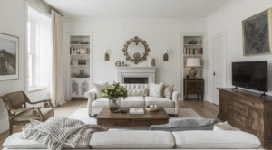
Traditional/Rustic: Soft whites such as Farrow & Ball’s Pointing look stunning against natural wood and traditional furniture pieces. “If you’re not sure in which direction you prefer for your home, a Colour Consultation will quickly give you choices based on architectural type, flooring, and furniture already in the home,” rather than chosen for its trending qualities.
4 . Think Beyond Walls: Ceilings, Woodwork & Trim
White is not only used on walls. You are also expected to pick white for:
Ceilings: A slight cooler or pure white will reflect light well. Do not use warm whites on ceilings, as it looks dingy; ceilings can be painted
Skirting Boards and Trim: Similar to the wall colours but slightly contrasting is ideal.
Kitchens & bathrooms: Look for moisture-resistant, wipeable finishes in neutral whites. Open-plan interior design might be facilitated by consistent white colours on walls and ceilings; in addition, a change in finishes, like matte and satin finishes, can help to differentiate space by Space Planning.
5 . Top White Paint Picks
Below are some of our favourite whites that are commonly used in homes throughout the UK:
Farrow & Ball – Strong White: A soft grey-white with a modern edge. Great for open-plan spaces.
Little Greene – Shirting: A true, clean white that works beautifully in modern homes.
Dulux – Jasmine White: Soothing warm white with a hint of heat, popularly used in traditional interiors.
Crown-Soft Linen: A creamy off-white tone perfect to create a cosy, welcoming feeling. These shades are being continuously specified by one-man bands through to larger practices, such as Luxury Interior Designers in London, when the client requires a neutral base which will not date anytime soon.
Final Thoughts
It’s more than just selecting the brightest of them all from that colour chart. The light, the function, and the mood of your space play a vital role. Here at Oraanj Interiors, we always recommend taking a few samples on multiple walls and reviewing them for a few days before committing to one.
As a well-established Interior Design Studio in London, we take a full-service approach to interior projects, where finishes such as paint are considered alongside layout, lighting, and materials for a cohesive outcome. Our studio has received recognition within the UK design community for residential interior work, reflecting the consistent attention to detail and long-term livability.
Whether one is renovating a single room or a full home, the same careful process applies: one measures light levels, assesses proportions, and refines palettes. This is a common approach in many high-end practices working on contemporary London homes.
