

Choosing the right colour palette for your home is one of the most influential decisions you can make in interior design. Colour has the power to shape mood, define zones, enhance architectural features, and influence how a space feels emotionally and visually. A thoughtfully selected palette can make a room feel calm, energising, sophisticated, or welcoming, depending on your intentions.
With endless shades, finishes, and combinations available, the process can feel overwhelming. However, by understanding a few essential principles and taking a structured approach, it becomes far more intuitive. Whether you are redecorating a single room or refreshing your entire home, the right palette will bring cohesion and personality to your interiors.
Professional Colour Consultation services often play a key role in helping homeowners make confident and informed decisions that align with both lifestyle and aesthetics.
Understand Colour Basics
Before diving into paint charts and fabric samples, it is essential to understand the fundamentals of colour theory. The colour wheel remains one of the most valuable tools in interior design, illustrating how colours relate to one another and how they can be combined harmoniously.
Primary colours — red, blue, and yellow — form the foundation of all other colours. When combined, they create secondary colours such as green, orange, and purple. Further mixing results in tertiary colours, offering a wide spectrum of nuanced shades.
Understanding these relationships allows you to predict how colours will interact within a space. It also helps prevent common mistakes, such as selecting tones that clash or overwhelm. This foundational knowledge provides the confidence to experiment while maintaining balance and cohesion.
Colour Harmony
Colour harmony refers to combinations that are visually pleasing and comfortable to live with. Choosing the right harmony ensures that your space feels intentional rather than chaotic.
Monochromatic
A monochromatic scheme uses variations of a single colour through changes in shade, tint, and tone. This approach creates a refined, elegant look that feels calm and cohesive. It works particularly well in minimalist interiors or spaces where tranquillity is a priority.
Analogous
Analogous colour schemes involve colours that sit next to each other on the colour wheel, such as blue, blue-green, and green. These combinations are naturally harmonious and soothing, making them ideal for living rooms, bedrooms, and open-plan spaces where flow is important.
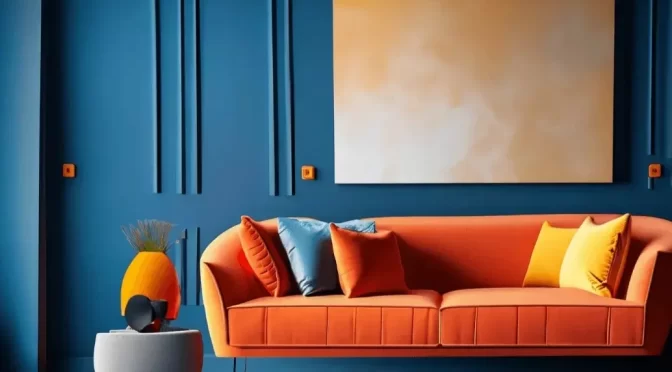
Complementary
Complementary schemes pair colours that sit opposite each other on the wheel, such as blue and orange. This creates strong contrast and visual interest. While bold, this approach works best when one colour dominates and the other is used as an accent.
Triadic
Triadic schemes use three colours evenly spaced around the wheel, offering a balanced yet lively look. When carefully controlled, this harmony brings energy without overwhelming the space.
Split-Complementary
A split-complementary scheme softens contrast by using a base colour alongside the two colours adjacent to its opposite. This approach offers visual interest with greater flexibility and is often easier to live with long-term.
Assess Your Space
Every space has unique characteristics that directly influence how colours behave. Assessing these factors before finalising a palette is essential for achieving a successful outcome.
Room Size and Shape
Lighter colours can make smaller rooms feel more open and expansive, while darker tones create intimacy and depth in larger spaces. In awkward or open-plan layouts, colour can be used strategically to define different areas and improve flow.
Natural Light
The amount and direction of natural light dramatically affect colour perception. South-facing rooms can handle deeper, warmer tones, while north-facing rooms often benefit from lighter, warmer hues to counteract cooler daylight.
Existing Elements
Consider fixed features such as flooring, cabinetry, fireplaces, and architectural details. Your colour palette should enhance these elements rather than compete with them. Thoughtful Furniture Selections also play a crucial role in maintaining harmony throughout the space.
Room Function
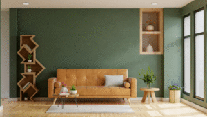
Each room serves a different purpose, and colour should support that function. Soft blues and greens promote rest and relaxation in bedrooms, while warmer tones can encourage energy and conversation in kitchens and living spaces.
Define Your Style
Your colour palette should be an extension of your personal taste and lifestyle. Understanding your design style helps narrow choices and ensures a cohesive result.
Modern
Modern interiors favour simplicity and clarity. Neutral tones such as whites, greys, and blacks are often paired with bold accents to create contrast and sophistication.
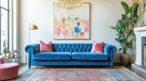
Traditional
Traditional spaces lean towards timeless palettes, including rich blues, warm creams, and deep reds. These colours complement classic detailing and layered textures.
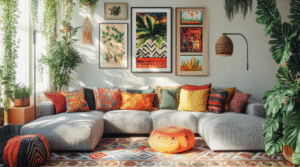
Bohemian
Bohemian design celebrates individuality through vibrant colours, layered patterns, and earthy tones. This style allows for creativity and personal expression.
Scandinavian
Scandinavian interiors prioritise light, warmth, and simplicity. Pale neutrals, soft pastels, and natural materials create a calm and functional environment.
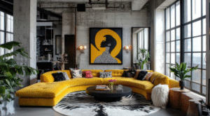
Industrial
Industrial spaces embrace raw materials and muted palettes. Greys, blacks, and metallic finishes dominate, often accented with warm tones for balance.
Many homeowners seek guidance from an Interior Decorator London professional to help define and translate their style into a cohesive colour story.
Create a Colour Scheme
“Once you understand colour theory, your space, and your style, you can begin building a well-balanced palette. This is particularly important when working with subtle tones, as Neutral Doesn’t Mean Boring: How to Use Neutrals with Impact shows — carefully layered neutrals can create depth, sophistication, and visual interest without overwhelming a space.”
Start with a Base Colour
Your base colour forms the foundation of the entire scheme. Neutral shades such as white, beige, or soft grey provide flexibility and longevity, allowing other elements to evolve over time.
Select Accent Colours
Accent colours add depth and personality. These may be inspired by artwork, textiles, or statement furniture pieces. Keeping accents intentional prevents visual clutter.
Add a Pop of Colour
Introducing a bold element adds energy and interest. This could take the form of cushions, artwork, or carefully placed Feature Walls that draw attention without overwhelming the room.
Balance the Tones
A successful palette includes a mix of light, medium, and dark tones. This balance creates dimension and ensures the space feels layered rather than flat.
Tools such as Mood Board Design are often used by professionals to visualise how colours, textures, and materials work together before final decisions are made.
Test Your Colours
Testing colours in the actual space is one of the most important steps in the process. Lighting conditions vary throughout the day, and a shade that looks perfect on a sample card may appear entirely different on your walls.
Paint small test areas and observe them in both natural and artificial light. This allows you to assess undertones and ensure consistency across adjoining spaces. Testing also helps avoid costly mistakes and ensures confidence in your final choice.
Incorporate Textures and Patterns
Colour works best when paired with varied textures and finishes. Matte walls can be enhanced with glossy furniture, metallic accents, or tactile fabrics. These contrasts add richness and visual interest without relying solely on colour.
Patterns also play an important role, whether introduced through rugs, wallpaper, cushions, or upholstery. The key is balance — too many competing patterns can feel overwhelming, while carefully selected ones enhance the overall scheme.
Stay Flexible
Your home should evolve with you. While major elements such as walls and flooring are best kept neutral, accessories and soft furnishings offer flexibility. Cushions, throws, artwork, and decorative objects allow you to refresh your space seasonally or as trends change.
Working with a professional Personal Shopper for interiors can help you source the right accessories and finishes without unnecessary stress, ensuring every addition complements your existing palette.
Conclusion
Choosing the right colour palette for your home is a rewarding journey that blends creativity with thoughtful planning. By understanding colour theory, assessing your space, defining your style, and testing your choices, you can create interiors that feel harmonious, personal, and timeless.
Colour has the power to transform not just how a space looks, but how it feels to live in every day. Whether your preference is calm and understated or bold and expressive, the right palette will elevate your home and reflect who you are.
For expert guidance and bespoke solutions tailored to your lifestyle, trust Interior Design London specialists at Oraanj Interior Design to bring your vision to life with confidence and clarity.
